Showcase exclusive deals, discounts, and trending products
E-commerdesigned to showcase exclusive deals, discounts, and trending products
COMPANY
Deal Zone
ROLE
UI Designer and Researcher
EXPERTISE
UX/UI Design
YEAR
2024
Project description
Overview
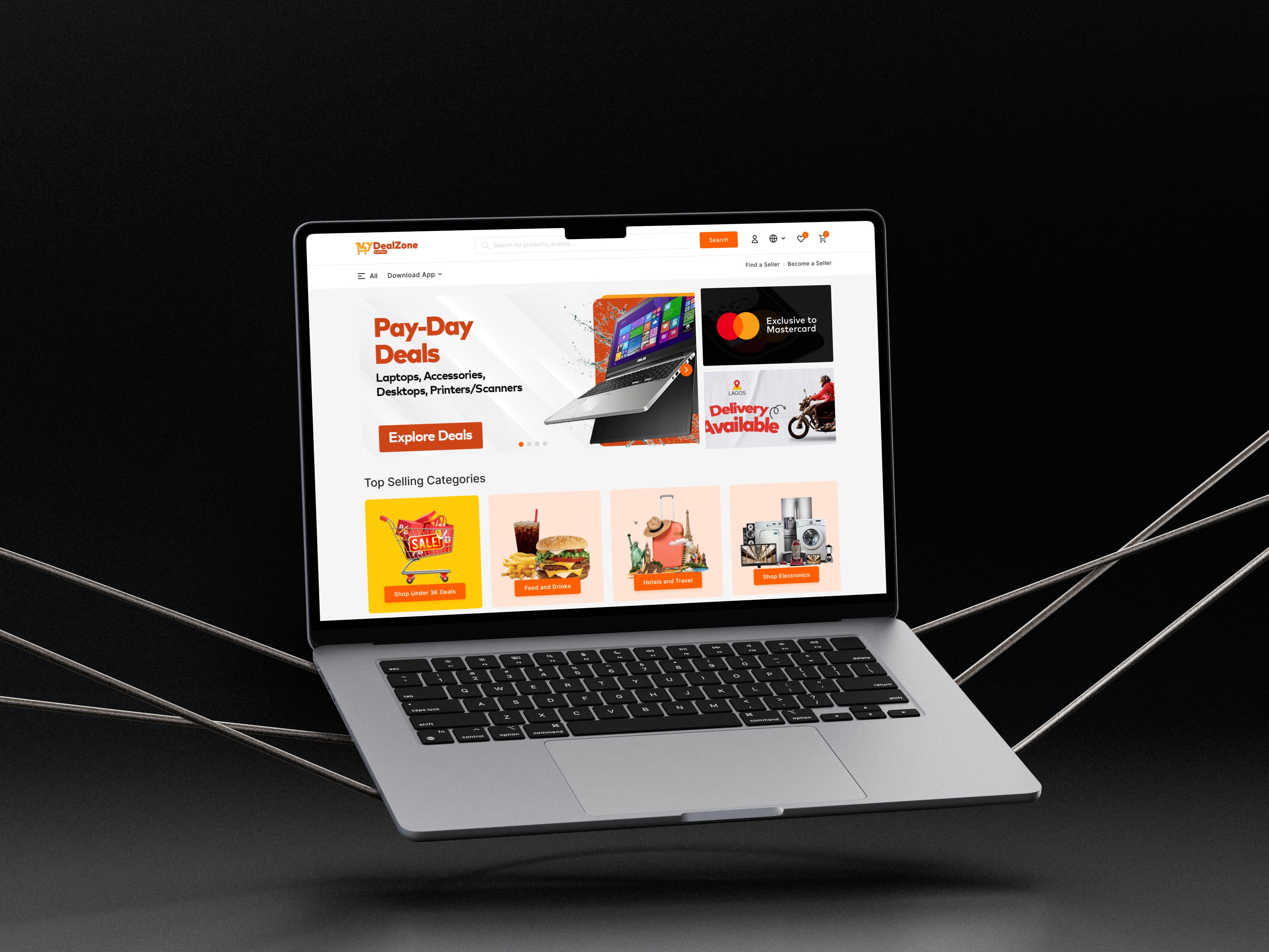
My Deal Zone is an e-commerce landing page designed to showcase exclusive deals, discounts, and trending products in a visually appealing and conversion-focused way. The goal was to create a landing page that builds trust, excitement, and urgency, while making it easy for visitors to explore products and take action.
The Problem
E-commerce businesses often lose potential customers due to:
Cluttered landing pages with too much information.
Poor visual hierarchy that buries key deals.
Lack of trust signals (reviews, secure checkout indicators, etc.).
My Deal Zone aims to solve these problems by designing a landing page that:
Highlights daily/seasonal deals upfront.
Provides clear navigation and categories.
Builds trust with customer testimonials and secure payment badges.
Process
This category details the step-by-step approach taken during the project, including research, planning, design, development, testing, and optimization phases.
Goals
Increase conversions and click-through rates by simplifying the layout.
Create a visually striking hero section that grabs attention immediately.
Ensure the landing page is mobile-first and responsive.
Communicate urgency with limited-time offers and countdowns.
Design Process
Research & Inspiration
Analyzed high-performing e-commerce platforms like Amazon, Jumia, and Groupon.
Studied UI patterns for deal-centric landing pages.
Identified key motivators for shoppers: urgency, discounts, social proof.
Wireframing & Structure
I created low-fidelity wireframes to define the structure:
Hero Section: Big, bold deal banner with CTA.
Featured Deals: Grid layout showcasing popular items with discounts.
Category Highlights: Quick access to trending categories.
Social Proof: Testimonials and reviews to build trust.
Urgency Elements: Countdown timers, "X items left" tags.
Footer: Newsletter subscription and secure payment badges.
Solution
Challenges & Solutions
Challenge: Balancing visuals with conversion-focused CTAs.
Solution: Used strong hierarchy—deals are visual, CTAs are bold, distractions minimized.
Challenge: Preventing information overload.
Solution: Focused on a modular design system—users see top deals first, then scroll for more.
Challenge: Ensuring mobile responsiveness.
Solution: Prioritized vertical stacking, collapsible menus, and sticky CTA buttons.


Results
Here, the outcomes and achievements of the project are highlighted, including user feedback, adoption rates, and industry recognition.
Final Outcome
The final landing page is visually dynamic, trust-focused, and conversion-driven. It:
Highlights hot deals with urgency.
Provides smooth navigation to categories.
Builds user trust with reviews and badges.
Encourages action with clear CTAs and a newsletter incentive.
Takeaways
Designing e-commerce landing pages requires a balance between aesthetic appeal and conversion psychology.
Urgency + trust + clarity are the three biggest drivers of sales-focused design.
A modular grid system ensures scalability for future updates and campaigns.
VIEW PROTOTYPE LINK CLICK TO VIEW